In the world of gastronomy, a restaurant’s visual identity holds immense significance alongside the culinary delights it offers. It serves as the initial impression that greets diners, often setting the tone for their entire dining experience. Such was the case for Akeel, an example our marketing and graphic design teams created for reference, which represents a food truck celebrated for its delectable traditional recipes. They fully grasped the vital role of a strong visual identity in complementing their culinary prowess.
Akeel embarked on a journey. Their mission? To create a visual identity that not only reflected their authentic Arabic cuisine but also captivated the hearts and appetites of their patrons. The result was astonishing. A seamless blend of tradition, modernity, and a vibrant palette came together to convey the essence of their mouthwatering dishes.
The Arabic Theme: A Taste of Tradition
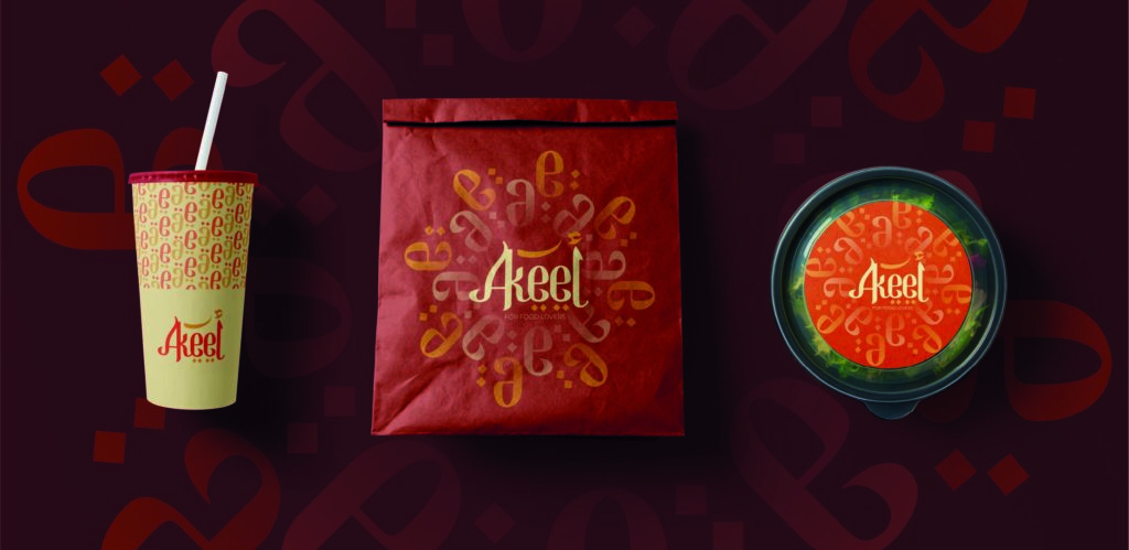
Akeel’s journey began with a profound choice—to embrace its Arabic heritage. The decision to incorporate Arabic elements into its visual identity went beyond aesthetics; it was a tribute to the rich culinary traditions that have been handed down through generations.
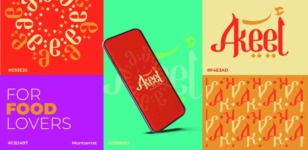
Akeel embraced the rich cultural heritage of the region with Arabic calligraphy style yet used it in English letters is a distinctive feature in its visual identity. The exquisite artistry found in the fluid lines and intricate curves of the script beautifully captured the elegance and authenticity that defines Akeel’s culinary offerings. Each stroke of calligraphy effortlessly conveyed the essence of their delectable creations.
The Montserrat Font: A Blend of Tradition and Modernity
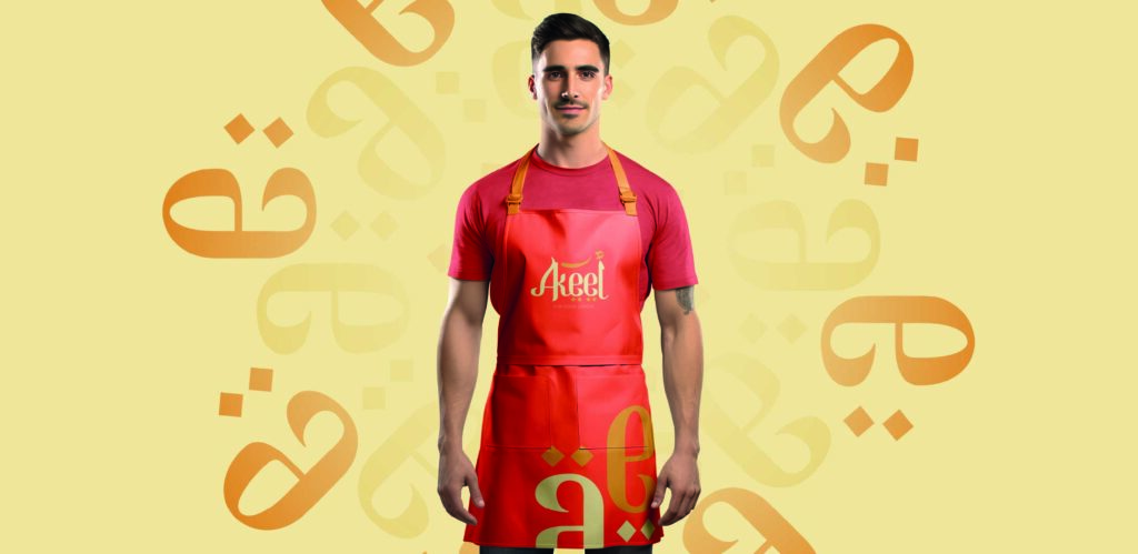
A crucial aspect of Akeel’s visual identity was choosing the perfect font. After careful consideration, they settled on Montserrat, a font that seamlessly blended tradition and modernity. With its clean and sleek sans-serif style, Montserrat added a contemporary flair to the Arabic theme while maintaining legibility and accessibility in different mediums.
A Colorful Palette: A Feast for the Eyes
The colors used in Akeel’s visual identity play a key role in stimulating appetite and evoking emotions. Inspired by the ingredients used in its dishes, Akeel’s branding features a harmonious color palette that is vibrant and inviting. Warm, oriental tones and rich hues create an irresistible temptation for anyone who encounters its offerings.
The Identity in Action: A Visual Feast
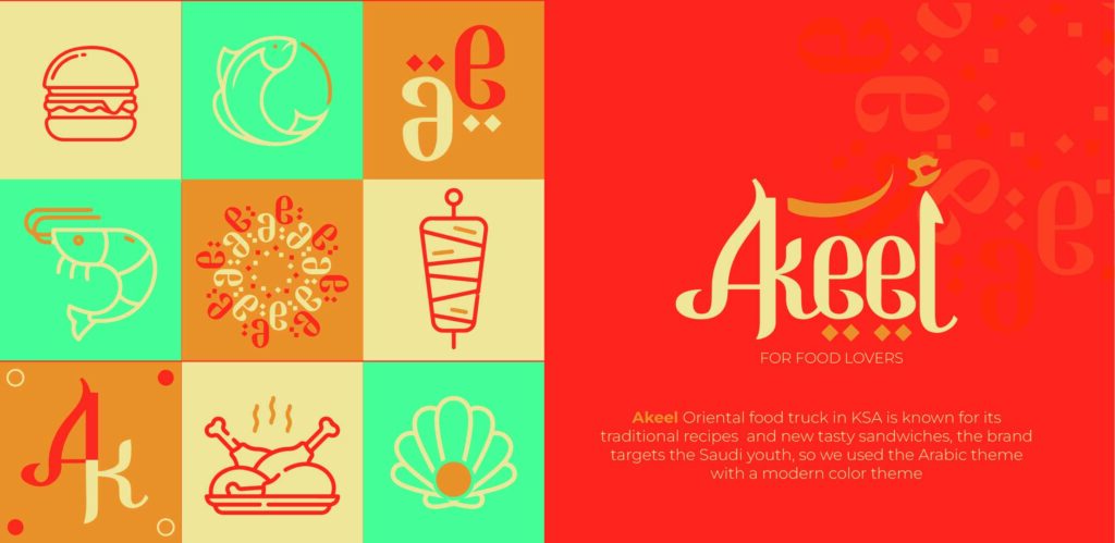
Akeel’s visual identity goes beyond its logo and branding materials. Every aspect of the dining experience, from food truck signage to menus, is thoughtfully designed to fully immerse customers in the unique Akeel experience.
The branding is adorned with beautifully crafted Arabic elements, adding an elegant and authentic touch. The use of the Montserrat font makes it easy to read the menu items, inviting diners to explore the delicious offerings further. The color palette consists of warm and inviting tones, creating a perfect setting for a memorable culinary experience.
Conclusion: Akeel's Visual Identity—Where Tradition Meets Innovation
The process by which AlphaGraphics developed Akeel’s visual identity showcases the profound impact design can have in the realm of restaurants. It serves as a prime illustration of how a meticulously crafted visual identity has the ability to enhance the dining experience and forge a lasting bond with customers.
Akeel has successfully captivated diners with its delicious dishes and unforgettable dining experience by embracing its Arabic heritage, utilizing the elegant Montserrat font, and incorporating a vibrant color palette. The restaurant’s visual identity beautifully merges tradition and innovation, inviting all to savor the authentic flavors it offers.


